Warm reds, terracottas, and ambers energize gatherings, encouraging conversation and appetite, while cool blues and soft greens slow the pulse and quiet busy minds. Which spectrum suits your lifestyle? Tell us in the comments and subscribe for more insights.
Color Psychology That Shapes Space
Dial down saturation for serenity and subtlety, or dial it up for lively focus and playful momentum. Brighter values expand perceived space, while deeper values feel cocooning. Experiment, share photos of your tests, and ask for tailored palette suggestions.
Light First: How Illumination Transforms Color Mood
Natural Light and Orientation
North-facing rooms love warmer tones that counter cool daylight, while south-facing spaces can embrace fresher, cooler palettes. Test swatches at multiple times of day. Post your window orientation, and we’ll recommend time-proof hues.
Bulb Temperatures and CRI
A 2700K bulb feels cozy and intimate; 3000–3500K keeps kitchens crisp; 4000K suits task-focused studios. Aim for CRI 90+ to reveal true color. Curious which bulb belongs where? Ask below and get quick, practical guidance.
Layered Lighting to Tune Emotion
Blend ambient, task, and accent lighting to steer mood from calm to celebratory without repainting. Dimmers make evening hues velvety and forgiving. Tell us your favorite lighting challenge, and we’ll share a simple three-layer recipe.
Analogous Calm for Restful Rooms
Neighboring hues like blue, blue-green, and jade create a gentle continuum that soothes the senses. Perfect for bedrooms and spa-like baths. Want a personalized trio? Describe your room’s light, and we’ll propose a restful sequence.
Complementary Energy for Social Spaces
Opposite hues—think teal and rust—add vibrant tension suited to dining rooms or living areas. Balance with textured neutrals to avoid visual fatigue. Share your entertaining style, and we’ll fine-tune the ratio from bold to balanced.
Neutral Foundations, Expressive Accents
Base a room in warm greige or soft oat, then rotate seasonal accents—citrine in spring, merlot in winter. This strategy protects longevity and budget. Tell us your palette turnover goals, and we’ll suggest a year-round accent plan.
Materials, Texture, and Finish: Color Beyond Paint
Matte finishes diffuse light, calming busy palettes; gloss amplifies color, energy, and reflections. Satin offers a sophisticated middle ground. Post your room’s purpose, and we’ll recommend finishes that match your desired atmosphere.
Materials, Texture, and Finish: Color Beyond Paint
Velvet deepens color and feels plush, linen breathes and cools, boucle softens edges. Layering textures makes restrained palettes feel rich. Share a fabric you love, and we’ll suggest complementary hues to heighten that tactile story.
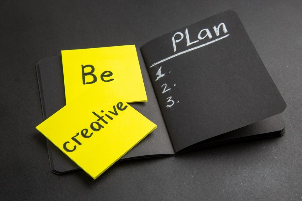
From Brief to Blueprint: A Real-World Story
The Problem: Scattered Studio, Scattered Focus
A compact studio felt restless—too many tiny colors, no hierarchy. The owner craved calm for weekday focus and warmth for weekend guests. Have a similar space? Describe your challenges, and we’ll map first steps together.
The Plan: Zoning with Teal and Terracotta
We grounded work hours with desaturated teal at the desk wall, warmed the lounge zone with terracotta textiles, and kept an alabaster shell for continuity. Interested in specifics? Ask for our swatch list and placement diagram.